Tuesday, 2 April 2013

4) How did you use media technologies in the construction and research, planning and evaluation stages?

Research and Planning
The research and planning part of our coursework involved searching different artists for inspiration for our music video task. This was done using Web 2.0 technologies such as YouTube, to search artists of a particular genre, which I found the most useful. I also looked at different official artist/band websites as these included music videos of the artists I was interested in. I found the internet very useful as it global, and so I was able to access artist information and music videos from all over the world, giving me better research resources to learn more about genre conventions. 
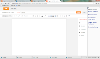
I was able to keep track on what I was doing using the website Blogger.com This website was extremely useful to me as this allowed me to create blog posts to present my research and planning effectively. I was also able to embed HTML codes from YouTube so I could display music videos on my blog and also PowerPoints by using the website SlideShare.net This is another example of web 2.0, as the website has allowed me to both consume media and then create media for other internet users.
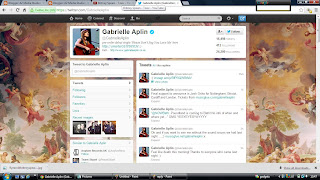


When I had to get permission off the artist I wanted to use for my music video I used her Official Website on the internet to find her e-mail address. I was then able to contact her using Hotmail.com, however this wasn't successful as she didn't receive it for quite a while. On the other hand I thought it would be a good idea to contacts her on Twitter, a social networking site as I noticed that she uses it quite a lot. I then tweeted her and she replied not long after, however the fact that I was only able to use a certain amount of characters in the tweet made it a little difficult. 


When researching the particular genre I wanted to use for my music video I decided to use the website Prezi.com as this allows me to display my work effectively using pictures and interesting effects. I really liked this way of working and was able to do this by 'picking a template' when signed into Prezi and then adding text by simply clicking in the area you want to write. On the other hand, this way of working wasn't always successful as sometimes it would not let you post images on your presentation, making it difficult to display work effectively. 

I also produced an Animatic for my music video using Abdobe Premiere Pro, where I imported pictures I took for my Animatic using a DSLR Camera and then imported the song I was using so I could edit the pictures to go in time with the music. I then embedded this to Blogger.com and then onto Facebook (another social networking site) where I gained feedback from others. I was also able to access this feedback using my Iphone, which was useful as it is a quick and easy way to access Facebook however this wasn't my preferred media to use as its quite small and difficult to read. 

Production
When taking photos for my Magazine Advert and Digipak I decided to use a DSLR Camera. I really enjoyed using the camera as it had many different settings which I could change depending on where and what I wanted to take photos of. For example when I wanted to take a close up of something I changed the setting to 'Macro' as this allowed the camera to focus on the object and leave everything else out of focus. I also took photos of landscapes in the dark, where I found that it was extremely hard to get a clear picture as the shutter was very slow in the dark. However I decided to look up on the internet how to get the camera to take a clear image, which resulted in me changing the Iso Sensitivity and slowing the shutter right down. It also advised that I use a tripod, and I was able to borrow my brothers, which enabled me to take some clear photos of the city from around my area.
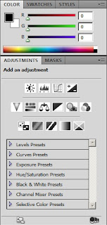
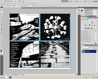

To edit my Magazine Advert and Digipak I used Abdobe Photoshop CS5 where I changed the images to black and white by going onto the adjustment panel and changing the saturation. To create the artistic effect I did the same again however this time I altered the Threshold and then changed the Brightness and Saturation for a more pop art effect. This also allowed me to get rid of all the pen parks that I created when I drew each image. Using professional media technology such as Adobe Photoshop allowed me to replicate something  that would be produced in the media industry. 
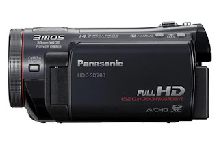


When it came to actually filming the music video, I used a Panasonic HDV Camera. To begin with I found the camera quite difficult to use as I wasn't familiar with the buttons and settings. However, once I had got the hang of it I found it very useful, especially as the zoom button was on top of the camera which made it a lot easier to use and allowed me to create effective and professional shots. I was able to watch the videos on the camera by simply switching the setting to play mode where it displayed all of the clips I had filmed. I was also able to access these clips on the computer quickly as the clips were recorded straight onto an SD card, which was very convenient. I also used a Camera Tripod which allowed me to create smooth pans that replicated shots created in film and other music videos. 
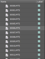

The main piece of software we used when creating our music video was Adobe Premiere Pro. This allowed me to import the video clips and then arrange them in succession to one another to create an understandable narrative for our music video. I was able to zoom into each clip and then use the razor tool to make precise cuts. This helped the music video become a lot more synaesthetic and also made aspects of the video such as the lip syncing a lot more accurate. On the other hand, when creating my music video I found that everything had to be kept in one folder otherwise the clips would not work, which I found quite inconvenient as this made finding certain videos quite difficult. I also found that I had to render my work every 10 minutes in order for the video to flow properly when playing, which I found a quite time consuming. 

Evaluation
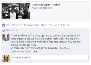
To find out feedback for my music video I decided to make use of web 2.0 and social networking sites such as Facebook. I was able to do this by creating a group named 'A2 Media work' and then adding people from my focus group to it so it pops up as a notification on their profile. I was able to upload my music video straight from Youtube and I was able to gain feedback quickly and effectively, allowing me to improve my work and create a more successful media product.

I also used Prezi and Powerpoint again when presenting my evaluation as this provides an easy and more interesting way to present information. I was able to then paste the HTML codes onto my blog and use Slideshare.net so my Powerpoints could be viewed. This links in with David Gauntlett's theory of a "sit back and be told" media culture transforming into a "making and doing culture". This is significant as conventional research methods are being replaced by new methods which recognize and make use of people's own creativity, and brush aside the outmoded notions of' 'receiver' audiences and elite 'Producers'.

Wednesday, 27 March 2013

question 3 - What have you learned from your audience feedback?


Before the production of my music video I created a pitch, which explained everything I wanted to do in my music video and how I was going to do it. I think it is really important to to get feedback on this before starting as this gives me a rough idea on what will work and what won't when making the music video and will help me form a more coherent plan. I was able to gain feedback by asking the audience to fill in a feedback form. Here are some of the questions/comments that were asked to be filled in:-


In order to find out whether my music video was successful I decided record people In my class as they watched the video, and then I asked them questions on what they thought of it afterwards. I thought it would be a good idea to ask them specific questions as this shows me how I could have changed my video to create more successful media product. 

Here are some of the questions I asked my audience:-

Did the narrative suit the genre?
I think this Is a fairly important question as I wanted my audience to be able to identify the video as 'indie folk'. On the other hand, as it is a love story I was slightly worried that the video would be too generic and fit into a more pop-like genre.

Did you find the music video boring/entertaining?
I decided to ask this question as it is very straight forward, and as my video is quite redundant and long I wanted to know whether my audience started to get bored while watching the video, which I hoped wouldn't happen. I also wanted to know whether it would allow the audience to escape from something unpleasant, like coursework/exams or whether they felt like it was something to watch if they had nothing else to do.

Uses and gratification – what did you gain from it?
I believe this is a very important question as business models have now changed from a push to a pull model, meaning they are having to subdue to the demands of their audience in order to keep them engaged. This means that audiences are now listening and watching music videos for their own uses and gratification, which is significant as I want my audience to enjoy the representations/messages and values and hopefully gain something from watching the music video.

Is the Mis En Scene realistic?
I thought this would be a good question to ask as I wanted my audience to see my video as very realistic and down to earth as it is indie folk, and therefore has quite an authentic home-made feel. I think it is important that the locations I used are realistic as I want the narrative to look believable, so my audience are able to watch the video and relate to it.

Do you think it's redundant or entropic?
This question lets me find out whether my I was successful in trying to make my video quite redundant, as genre is dependant on a high degree of redundancy, and I think it is important that my video isn't too entropic as this might steer my audiences away from the product.


Conclusion of initial audience feedback:


Overall I am very pleased with the feedback I received, as this shows that my audience have taken a preferred reading of the text. On the other hand, not all of the audience listen to indie folk music and so they may not have had enough cultural capital to understand the genre and intertextual references in my product. This lead me to ask a friend of mine who is very much into the indie folk genre to take a look at my video on Facebook and give me some feedback.
I asked him what he liked/disliked about the video, what I should perhaps change and whether he enjoyed the video or found it boring.


I'm really happy that he liked he the close ups and the silhouette shots as these were a very important factor of my video in order to create a bond between the audience and the singer. Andrew Goodwin also suggests that the demands of the record label will include the need for lots of close ups of the artist to develop motifs which recur across their work.

Tom also stated that if he had to change something he would have probably picked more interesting locations, but he said they worked really well regardless. This suggests that tom might have taken a negotiated reading, as Hall suggests we do not passively receive texts and are much more active.  I agree with this as the music video is quite long, and so using locations that aren't particularly interesting may steer the viewer away and they might find the video quite boring to watch. If I could do it again I'd still stick to the landscape shots as this is important in my genre, however I'd choose places which are bit more eye catching, such as areas with beautiful sceneries or interesting buildings. This would also give more contrast in the different locations the 'singer' would pass in the video, which I think would keep the viewer engaged and interested.

On the other hand when I asked Tom whether he found it the video enjoyable or boring to watch he said he felt it was “really professional” and the “constant changing of shots made it enjoyable to watch”. I am very pleased with this as although the locations weren't particularly eye catching he still found it enjoyable to watch as the locations are always changing in the video, keeping him engaged. 

Magazine advert/Digipak

This is the feedback I received when deciding what font to use for my magazine Advert/Digipak. I wanted my products to have quite an artistic and authentic feel, however I wanted to use a font which is quite sophisticated and serious to match the narrative of the music video. I wasn't quite sure which one to use so I decided to post a picture on Facebook to get some feedback from my focus group. All of my focus group agreed on the top one as as they believed the top one looked the most professional and a font that would be used by an established, yet alternative artist which I have chosen. I very much agree with this point of view and so I decided to use this font in my products. I also think it is important to take advice from your audience as they the ones who you are selling to.


Monday, 11 March 2013

Evaluation - 1) In what ways does your media product use, develop or challenge forms and conventions of real media products?


For my music video I decided to look at artists which shared the ‘indie folk’ genre of music. Some of these artists include Kt Tunstall, Amy Macdonald and Laura J Marling. The Indie folk genre was demonstrated in my music video through camera shots, editing and narrative. When researching different artists that share the genre I noticed that there are a lot of close ups of the singers face, which I decided to use in mine as this creates a bond between the audience and the singer and also encourages the audience to feel emotionally involved in the narrative. I also think this is important as Andrew Goodwin suggest that the demands of the record label will include the need for lots of close ups of the artist to help develop motifs which recur across their work. 


 My video also includes various long shots of different landscapes, as this demonstrates how the artist has travelled through the city to find her ‘home’, which is represented as a boy. I thought this would be effective as it is also very typical for this genre to have shots of landscapes to give a more authentic and undulating feel as seen in Ellie Goulding’s video 'The writer'.


When editing the music video I decided to use jump cuts to help create the passing of time. I also changed the speed duration in certain parts and put the singer in slow motion as I saw this in Amy MacDonald’s video 'Slow it down' and thought it appeared really effective and captivating. As my video is set over one day I also thought it would be a good idea to speed up shots such as when she's sat outside a shop and people are passing by quickly. I think this worked really well as the singer does not move the whole time, suggesting that she is not part of the crowd and showing a sense of isolation as she's thinking. I was very much inspired by Amy MacDonald’s video 'Mr Rock and Roll' and 'A team' by Ed Sheeran as they both use this form of editing in an effective way. 


Amy MacDonald’s song "Mr Rock and Roll" also inspired me to vary my shot types while filming the 'singer' run as she uses panning, low angle shots and hand held shots. This gave me the idea to hold the camera myself and follow the singer as she ran through the town centre, as well as panning the camera as she ran by at various different angles to match the pace of the music. I believe this is important as Andrew Goodwin suggests that there should be a relationship between music and visuals and that the tone and atmosphere of the visual reflects that of the music (which can either be illustrative, amplifying or disjunctive). My video is mainly amplifying as the song is about finding her 'home' and throughout the video the 'singer' is travelling through the city to find it. Goodwin also believes that this should be linked to Synaesthesia. My video is very synaesthetic as there is a physical representation of verse/chorus structure. This is produced through the performance side of my song and also through the editing.


When editing my music video I also made sure that my shots correspond with the beat of the song, especially when it builds a faster pace before the last chorus where my shots and editing is a lot quicker and abrupt. I was very much influenced by Laura Marling’s opening to her video 'Rambling Man', where it begins with a close up of her hand playing the guitar as the camera focuses. I thought this would be interesting to use in my own video as the guitar is the only instrument playing at the start, and performance is an important factor of my video as Pete Fraser suggests music videos feature some element of performance - singing and playing instruments and usually miming, which I use in my video various times. 


I also decided to dress the 'singer' in casual clothing as all of the indie folk female singers seem to not focus on their image but the meaning of the songs they are playing. For my Digipak and magazine advert I decided use images of places that represent the singer’s journey to find her 'home'. This is clearly shown as it consists of pathways, roads and alleyways that the 'singer' passes in the video. For the back of my Digipak however, I decided to take a photo of two people walking, which represents the singer and the boy in the video. I thought this would suit the back cover as it's the last thing you see, and my music video ends with the couple reunited.


 After looking at Laura J Marling and Kt Tunstalls adverts and Digipaks I noticed they all share quite an artistic style, which suits the genre as it gives quite a unique and authentic impression. I wanted this to be seen in my work also so I edited the photos and then drew them myself in black and white. I also noticed that they both have elements of nature in their Digipaks which I wanted to incorporate in mine, so I used a picture of a round plant to go behind the disk tray to match the size of the CD. I also thought this would suit the song especially as she is surrounded by nature a lot of the time in the music video. 


 I was very much inspired by the staves magazine advert as it is still very authentic and artistic looking but also very simplistic and effective. I decided to carry out the same theme of black and white but instead I decided to leave the top half of the advert white so the text can be seen clearly. I included the record label logo, album ratings and link to her website, which is all seen on The Staves advert. 


 Genre is dependent on a high degree of redundancy, and I think it is important that my music video, advert and Digipak fit into my indie folk genre as audiences don’t like change, especially as certain genres suit certain ages/genders in society and have expectations about the style or content of the text. Tom Ryall also refers to this as a “framework of structured rules, in the shape of patterns/styles/structures, which act as a form of ‘Supervision’ over the work of production of filmmakers and the work of reading by the audience. I believe that although my magazine Advert and Digipak fit into the indie folk genre quite well I also think that I have challenged and developed conventions also. I'd say that my magazine Advert and Digipak is quite entropic as I haven't just taken photos and put text over the top. I decided to edit the images in Photoshop by changing the image to black and white and then altering the threshold so the picture almost has a pop art effect. I was able to do this by clicking on the colour panel and then 'adjustments' where it gave me the option to alter the threshold by dragging the cursor along the line. (left image)

 I then decided to draw each image with fine liner pen and then scan it back in to add text and change the contrast, which you wouldn’t necessarily see in Indie folk magazine Adverts/Digipaks. I think the fact that this has made them appear bold and striking will attract my audience even more. When looking at Digipaks by indie folk artists I also noticed that they the singer is usually on the front cover, which I decided to go against as I didn't want my album to appear too commercial, as my audience are quite niche and care more about the music, rather than the artist’s image. 

I also decided to stick to black and white as this I thought looked more effective and entropic, even though the ones I had looked at were all in colour. I think it is good to challenge the forms and conventions however doing this too much can be dangerous, as this may result in the artist’s genre of music not being recognized or attracted by their target audience. On the other hand I still think it is important to include difference, as genre is never static but "shifting and slippery", according to Susan Hayward. 

I think the fact that I have completely changed the original narrative of the song also makes my video quite entropic. As the song is about the singer’s home I thought this would make the video too dull and boring. So, instead I decided to change the representation of the word 'home' to mean a boy. I thought this would have a good effect on the audience as having a story line or other complex fragments "leave the viewer with the desire to see them again" -Pete Fraser. However, this in a way makes the video quite redundant as quite a lot of indie folk songs are based upon the love between a boy and a girl.


 I also decided to stick to the black and white theme in my video to match the Advert and Digipak. This also makes the video appear more home-made and low budget which is what I wanted to achieve as the artist of the song is not that popular and probably wouldn't be able to afford making a high-budget video. I believe my video doesn't quite fit into Goodwin’s templates as he states that there is frequently reference to notion of looking and particularly voyeuristic treatment of the female body. My video does not include any male gaze as that is not what I wanted to portray. I wanted my audience to feel emotionally involved in the narrative and did not want the singer to be sexualised in a voyeuristic manor, hence why I did not film any sexual parts of the body and dressed her in non-revealing clothes.