Tuesday, 18 December 2012
Friday, 7 December 2012


Print work: Magazine advert

Print work: Magazine advert


Print work: inside left

Print work: Inside of digipak


Printwork: Organisation
I aim to have my drawing for the inside left of my digipak finished by the 5/12/12.
Print work: Inside right

Print work: Inside of digipak

Printwork: Organisation
I aim to have the picture for my disk tray edited and drawn by the 3/12/12. Again I will try and use my free's and time at home to complete this.
Print work: Inside of digipak
 For the inside of my digipak I'm think of using this for the right hand side area where the disk is placed. Mainly because of the shape as this would suit the CD disk tray and the flower also adds to the whole nature theme. Also, the girl in the music video will be passing quite of lot of this as she travels through the city.
 Print work: Back cover


Wednesday, 5 December 2012
Print work: Back cover


Print work: Organisation
I aim to have the inside left of my digipak edited and drawn by the 1/12/12. I will try and do this by using my free's at college and some time at home to get it finished.
Print work: Front cover - Finished

Print work: Feedback

Print work: Fonts

Tuesday, 4 December 2012
Print work: feed back

Print work: Organisation
I am planning to put my drawing on facebook to get some feed back. I will make sure this is done by 29/11/12.

Print work: Front cover
I have decided that I am going to use this image for my front cover as I think this has a good concept as the video is about a girl travelling through different places who eventually finds her 'home' which will be a boy. I thought the idea of a path suits this perfectly as this shows her journey to find him.

However i am not planning on leaving it like this, and so I am going to open it back up in photoshop and then edit it and maybe put it in black and white as this suits the indie folk genre. I will also need to figure out how I am going to work on top the image with either pen or biro for the authentic effect.
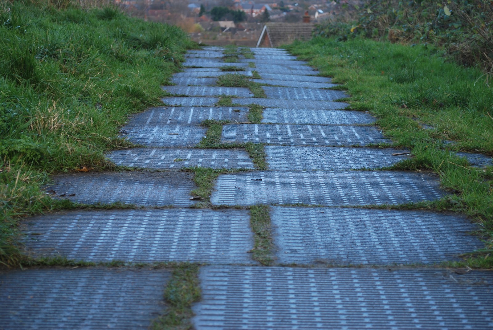
However i am not planning on leaving it like this, and so I am going to open it back up in photoshop and then edit it and maybe put it in black and white as this suits the indie folk genre. I will also need to figure out how I am going to work on top the image with either pen or biro for the authentic effect.
Print work: Extension
I have been given an extension for my advert and digipak which allows me to work on it for another week. I decided I needed one as I took a lot of photos and was struggling to come up with an idea. I was also ill for a couple of days and so I fell behind in my work. However now I have till the 7th of December to finish my digipak and advert which I feel should be enough time to get it all finished.
Print work: Images
When taking the photos, I found that it was extremely hard to get a clear picture as the shutter was very slow as it was dark, meaning I could not hold the camera still enough in that period of time. Here are some of the photos I took like this.

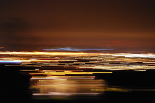


However I decided to look up on the internet how to get the camera to take a clear image, which resulted in me changing the iso sensitity and slowing the shutter right down. It also advised that I use a tripod, and I was able to borrow my brothers, which enabled me to take some clear photos of the city from around my area.


 I was able to take these photos as the shutter was set for round about 15 seconds, which meant whenever a car drove past their lights would create this effect which I really like.


However I decided to look up on the internet how to get the camera to take a clear image, which resulted in me changing the iso sensitity and slowing the shutter right down. It also advised that I use a tripod, and I was able to borrow my brothers, which enabled me to take some clear photos of the city from around my area.


Print work: Organisation
I have decided that I am going to take some more photos of scenery but this time at night. In order to do this I will have to borrow the camera out again, and then I will organise for a friend to drive to to different areas to take the photos. When taking my photos in the day time, I noticed a path at the top of my road which overlooks the city. I think at night time this will look really interesting so I am going to go there. This will happen on the 27/11/12.
Print work: Front cover
I'm thinking of using this image for the front cover of my digipack. I quite like the way the Branch is in focus as this enables me to edit the background and put writing over the top. I have already edited this image in photoshop by cropping out the tree branch, and then lightening the background. To give my digipak the authentic effect, I have put the tree branch back onto the lighter image and then I have worked ontop of it using a biro pen. However I have decided that I don't want to use this image for my front cover as the concept isn't very strong and it doesn't contain enough detail.


Subscribe to:
Posts (Atom)